

我写这个系列的目的,可能更倾向于自我总结,而不是教Flutter入门,所以可能有些东西是在我本人的理解下的一些用法与理解,不一定准确与适合所有开发者,如果有其他更好的想法,可以与我讨论,联系方式见关于
本项目基于macOS桌面程序,源码地址:https://github.com/NeverOvO/learningfoundation
-NeverOuO
前言
近期忙完了服务器迁移,也打完了《缺氧》的更新。最近应该会逐渐更新下博客的内容和我自己的网站组成了,预期的是会上线一个带有导航性质的Flutter Web应用,但是具体的内容更新逻辑还是不太理想,早期应该会作为一个静态APP上线网页。文章部分可能会去探索一些新的内容,比如分享一下我平时写Flutter时候的一些偷懒的注释、文档啥的,大伙感兴趣的可以看看。毕竟买服务器也花了不少钱,不能浪费啊。
然后之前的写作方式对于阅读负担太重,我从这篇文章开始直写出核心用法与部分常用用法了,如果写的比较跳脱请见谅。
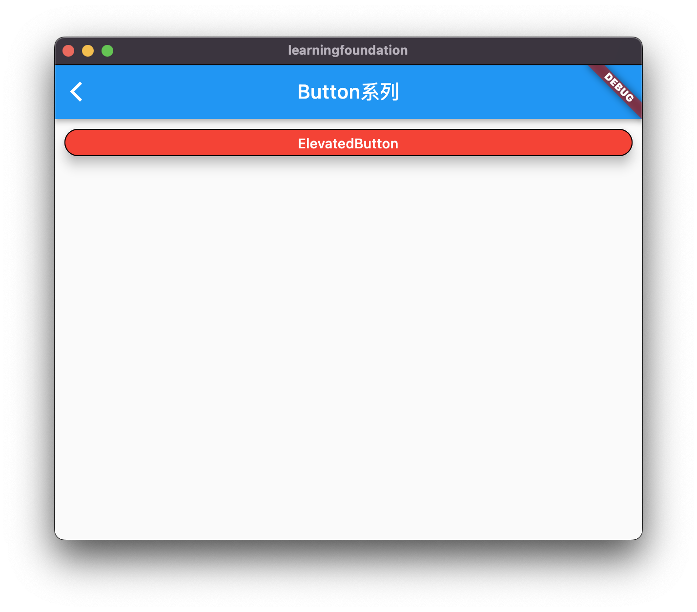
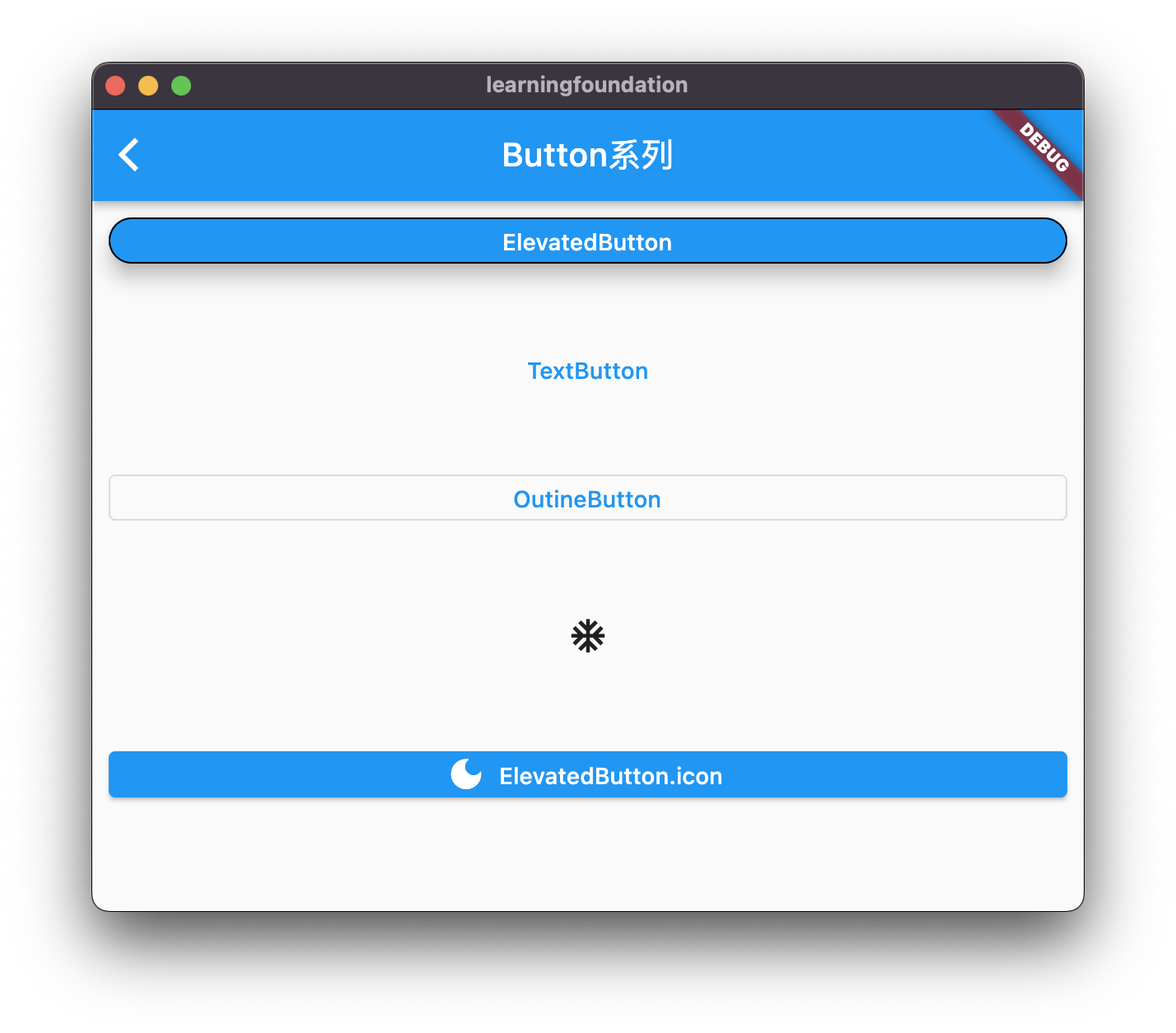
常用Button系列:ElevatedButton
这个button组件应该是目前效果最好的一个按钮样式了,同时也存在着比较多的限制的地方。
ElevatedButton属性
const ElevatedButton({
    super.key,
    required super.onPressed,
    super.onLongPress,
    super.onHover,
    super.onFocusChange,
    super.style,
    super.focusNode,
    super.autofocus = false,
    super.clipBehavior = Clip.none,
    required super.child,
  });
基础用法
ElevatedButton(
  onPressed: () {  },
  child: Text("ElevatedButton"),
),
必要方法
required super.onPressed, // 按下去出发的方法。
required super.child, //内部的子组件
常用方法
super.style  //控制按钮的样式,类型很多参考下面的常用用法。

const ButtonStyle({
  this.textStyle, //字体
  this.backgroundColor, //背景色
  this.foregroundColor, //前景色
  this.overlayColor, // 高亮色,按钮处于focused, hovered, or pressed时的颜色
  this.shadowColor, // 阴影颜色
  this.elevation, // 阴影值
  this.padding, // padding
  this.minimumSize, //最小尺寸
  this.side, //边框
  this.shape, //形状
  this.mouseCursor, //鼠标指针的光标进入或悬停在此按钮的[InkWell]上时。
  this.visualDensity, // 按钮布局的紧凑程度
  this.tapTargetSize, // 响应触摸的区域
  this.animationDuration, //[shape]和[elevation]的动画更改的持续时间。
  this.enableFeedback, // 检测到的手势是否应提供声音和/或触觉反馈。例如,在Android上,点击会产生咔哒声,启用反馈后,长按会产生短暂的振动。通常,组件默认值为true。
});
常用用法
ElevatedButton(
  style: ButtonStyle(
    backgroundColor: MaterialStateProperty.all(Colors.blue),//背景颜色
    foregroundColor: MaterialStateProperty.all(Colors.white), //字体颜色
    overlayColor: MaterialStateProperty.all(Colors.red),// 高亮色
    shadowColor: MaterialStateProperty.all( Colors.black),//阴影颜色
    elevation: MaterialStateProperty.all(10), //阴影值
    side: MaterialStateProperty.all(BorderSide(width: 1,color: Colors.black)),//边框
    shape: MaterialStateProperty.all(RoundedRectangleBorder(borderRadius: BorderRadius.circular(30))),//圆角弧度
  ),
  onPressed: () {  },
  child: Text("ElevatedButton"),
),

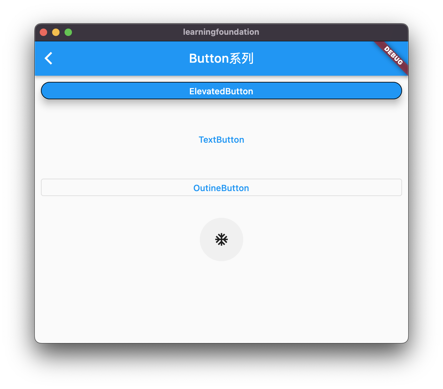
常用Button系列:TextButton
TextButton与ElevatedButton的属性相似,区别在于这个按钮已突出文本内容为主
基础用法/常用用法
TextButton(
  onPressed: () {  },
  child: Text("ElevatedButton"),
),

常用Button系列:OutlineButton
同TextButton,区别在于他一个边框,且默认无背景。
基础用法/常用用法
OutlinedButton(
  onPressed: () {},
  child: Text("OutineButton"),
),

常用Button系列:IconButton
此按钮的核心逻辑为突出Icon。
基础用法/常用用法
 IconButton(
  onPressed: () {},
  icon: Icon(Icons.ac_unit_outlined),
),
ElevatedButton、TextButton、OutlineButton的Icon构造函数
以下以ElevatedButton的icon构造函数为例子,另外2个方法相似。
用法
ElevatedButton.icon(
  onPressed: () {},
  icon: Icon(Icons.dark_mode),
  label: Text("ElevatedButton.icon"),
),
Comments NOTHING